Application Design I - Project 3 / Lo-Fi App Design Prototype
22.4.2024 - 19.5.2024 (Week 1 - Week 4)
Chong Hui Yi / 0363195
Application Design I / BDCM
Chong Hui Yi / 0363195
Application Design I / BDCM
Project 3 / Lo-Fi App Design Prototype
Table of Contents
1.
Lectures
2.
Instructions
3.
Project 3
4.
Feedback
5.
Reflection
LECTURES
Week 11:
Wireframe & UI Kit
INSTRUCTIONS
<iframe
src="https://drive.google.com/file/d/1vqYK31ZyWtsWEfmNzRwtmwszm9CcTWTq/preview"
width="640" height="480" allow="autoplay"></iframe>
Project 3: Lo-Fi App Design Prototype
Requirement
"Once the UX design process is completed, students can now create a low
fidelity prototype of the app. Students needs to arrange all the screen
wireframes, actions, visual feedback and link them up in Adobe XD/ Figma/
Invision Studio or any other prototype software’s. Students are then
required to perform usability testing whereby they will invite guests to
test out their low fidelity prototype and gather all the information,
response, feedback, pain points observed from the test. Students need to
document this process with video and produce a document containing detail
analysis of this task and the solutions to the problems faced by the
testers."
Sketch
First, I looked for references on Pinterest, Behance, and Figma
related to movie ticket booking apps. I found that most movie ticket
booking apps are designed with a dark theme, which might align better
with the cinematic experience. However, since the MBO Cinemas app's
theme colour is dark teal (Fig. 2.0), using a dark theme didn't look
good. Therefore, I decided to use white as the background and adopt a
light theme.
.jpg)
Fig. 1.0 Reference App design
After researching different movie ticket booking apps, I started
sketching simple drafts, which were very rough.

Fig. 1.1 Sketch Wireframe
UI Kit
In the Figma community, I found a UI Kit. For the brand colours
(Fig. 2.1), I initially chose them based on the MBO Cinemas app's
logo. However, during the high-fi prototype, I found that the red
colour really clashed with the design. The combination of deep
teal and red looked quite odd, so I decided to remove the red and
focus on the deep teal as the primary colour.

Fig. 2.0 MBO Cinemas app logo
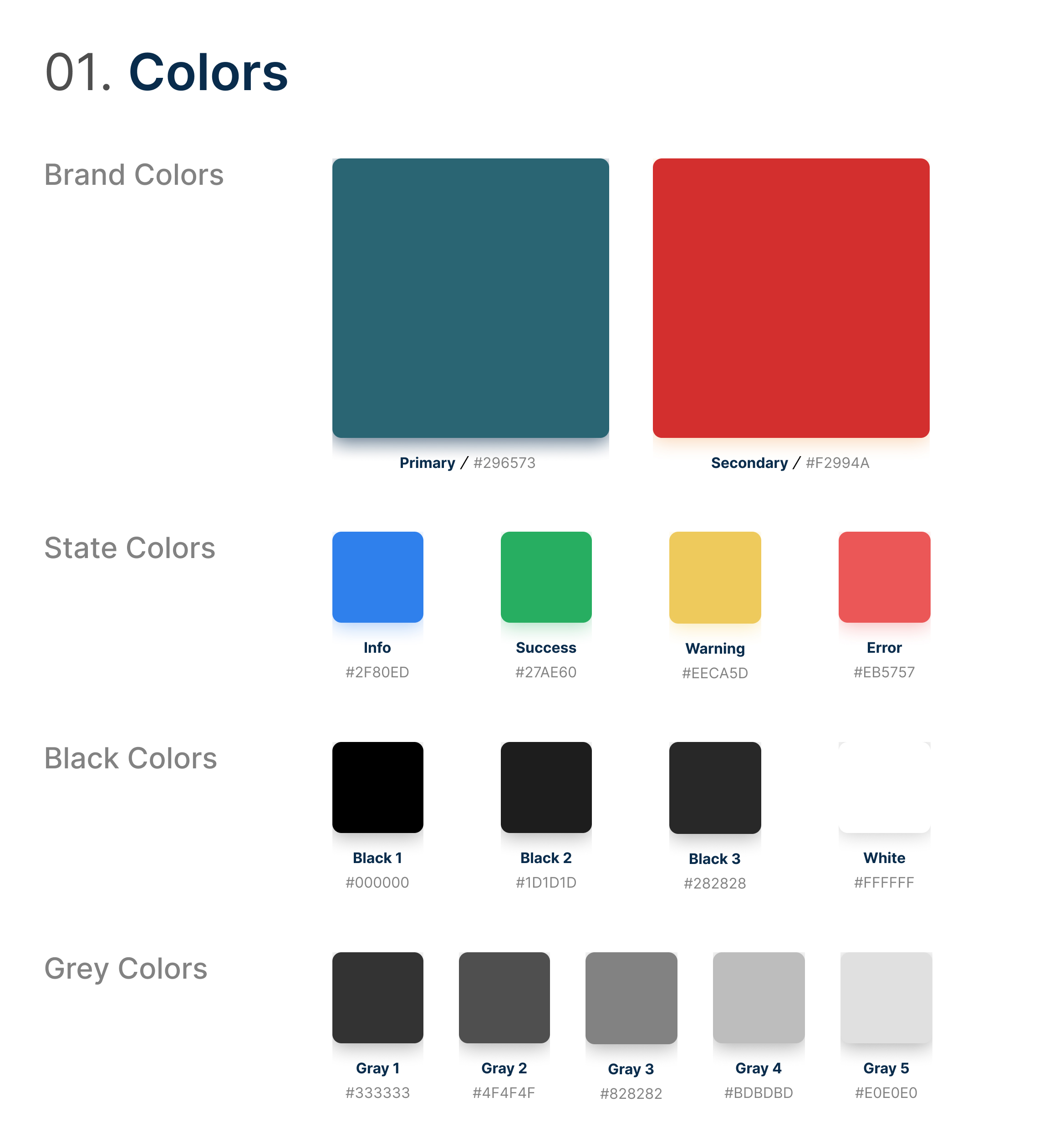
Fig. 2.1 Colour
For the fonts, I tried three different combinations of heading and
body text fonts, and I ultimately chose Roboto for the headings and
Open Sans for the body text.

Fig. 2.2 Font pairing #1

Fig. 2.3 Font pairing #2
Fig. 2.4 Font pairing #3 (final)
In the app design, I used icons from "Tabler" because they look
clean, neat, and rounded, making them suitable for modern and
minimalist pages.

Fig. 2.5 Icons I selected in Figma

Fig. 2.6 Iconography
For the grid systems, I used a 4-column layout with margins and
gutters of 19. When I realised I needed to add columns layout, I was
already halfway through, and then I discovered that my margins were
all set to 19. Otherwise, I would have chosen 20.

Fig. 2.5 Grid Systems
Fig. 2.6 Figma UI Kit
UI Kit Link:
Lo-Fi Prototype
Based on the results from the usability testing of the MBO
Cinemas app, the following changes are needed:
- Add Ratings & Reviews
- Add Promotions
- Allow users to purchase Food & Drink
- Reduce the size of the homepage images and include more movie information
- Make the layout cleaner and more organised
- Make it easier for users to select seats
- Place movie filters in a more prominent location and provide more filter options
# Due to time constraints, the focus is on the more critical
aspects.
I have decided that the first scenario will cover registration, login, and forgot password. Fig. 3.0 outlines the general process.
I have decided that the first scenario will cover registration, login, and forgot password. Fig. 3.0 outlines the general process.

Fig. 3.0 Login, Register & Forgot Password (flow)
Then, I began designing the homepage. Based on Mr. Zeon's feedback,
the most important feature should be in the centre of the bottom
navigation bar, rather than 'Cinemas'. Therefore, I replaced the
central icon in the bottom navigation bar with a QR code icon. This
page allows users to directly view their purchased e-tickets and
purchase history, which were originally placed under 'Profile' in
the MBO Cinemas app and were hard to find. Additionally, I added
text labels to the bottom navigation bar to help users understand
the icons better.
.jpg)
Fig. 3.1 Homepage (left: old, right: new)
The bottom navigation bar has five items: Movies, Cinemas, My Ticket,
Food & Drinks, and Profile. Since the Cinemas listing page, Food
& Drinks page, and Profile page are not the most important parts, I
only created a simple version of these pages without fully implementing
all functionalities. In the upcoming Scenario 3, the Movies listing page
will be used to find films with filters and rate them. The logout
function from the Profile page will also be utilised.

Fig. 3.2 These pages are from the bottom navigation bar

Fig. 3.3 Logout & Rating
In the current MBO Cinemas app (Fig. 3.3), there was only one page
without ratings and reviews. So I divided it into three sections:
Showtimes, Information, and Reviews, to make it easier for users to view
the details.

Fig. 3.4 Movie overview page (current MBO Cinemas app)

Fig. 3.5 Movie overview page (Showtimes, Information, Reviews)
During the design process, I found that the buttons on all my
original pages were too thin and lacked sufficient colour contrast.
Therefore, I made all the buttons thicker and used darker colours to
guide users more effectively. All buttons now feature an 8-pixel
corner radius.

Fig. 3.6 Button design process
On the Seat Selection page, to avoid having too much blank space,
I added basic movie information and details about the booking time
and location. This also allows users to confirm that they have
selected the correct ticket.

Fig. 3.7 Seat selection page (left: current MBO app design, right:
prototype)
In Fig. 3.6, you can see the flow of the entire ticket booking
process, including the added functionality for purchasing food
& drinks. Due to time constraints, I did not implement the
sections for selecting payment methods and entering details; it
goes directly to the payment confirmation.

Fig. 3.8 Buy ticket process
Fig. 3.9 Figma Low Fidelity Prototype
Low Fidelity Prototype Link:
Fig. 3.10 Figma Low Fidelity Prototype - Mobile Version
Low Fidelity Prototype (Mobile Version) Link:
Fig. 3.11 Usability Testing Video (3 user)
Fig. 3.12 Usability Testing Feedback
Based on user feedback, the buttons on the page shown in Fig. 3.13 (left
image) were found to be confusing because they did not clearly indicate
that they would navigate to the next page. I changed them to "Continue" to
guide users more clearly to proceed to the next step.

Fig. 3.13 Change to a clearer button label
Additionally, I realised that I had forgotten to include the onboarding
process, so I designed five pages with illustrations. These
illustrations were obtained from
Storyset, which
allows for customising colours, making it very convenient. The only
drawback is that sometimes the exact illustrations I need are not
available, requiring a lengthy search.

Fig. 3.14 Onboarding process
Final Low Fidelity Prototype
Fig. 4.0 Final Figma Low Fidelity
Final Low Fidelity Prototype Link:
Fig. 4.1 Final Figma Low Fidelity Prototype - Mobile Version
Final Low Fidelity Prototype (Mobile Version) Link:
Fig. 4.2 Final Low Fidelity Prototype Walkthrough Video
FEEDBACK
Week 13:
- The bottom navigation bar should have the most important function in the middle, such as QR code.
- The page designs are too similar; they can be more creative and have different layouts.
- Three user scenarios, such as login/logout, add to favourite list, buy food, buy tickets, etc.
REFLECTION
I find Project 3 to be the most challenging one, even more
difficult than the Final Project, because we had to design
everything from scratch. Initially, I had no idea how to design
an app. For example, I struggled with determining the
appropriate font size. Designing on a computer made it hard to
grasp the correct sizing, as what looks fine on a computer
screen may not be suitable on a mobile device. This is an area
where I need to explore and learn more. At the same time, this
project provided me with valuable experience in designing an app
for the first time.
Designing the low-fi prototype was interesting to me, and it was
at least more enjoyable than Projects 1 and 2. Throughout the
design process, I also learned more about Figma’s features, such
as adding animations and presenting with a phone frame, which
made it look very realistic. However, when I needed to make
changes to multiple pages after duplicating them, I had to
adjust each element one by one, which was quite frustrating (I’m
not sure if there’s a quicker way to do this).
Through this project, I also realized that designing a good app
is not easy. You have to consider various factors such as fonts,
layout, colors, and more.


Comments
Post a Comment