Advanced Typography - Task 2 / Key Artwork & Collateral
13.9.2023 - 7.11.2023 (Week 3 - Week 11)
Chong Hui Yi / 0363195
Advanced Typography / BDCM
Task 2 / Key Artwork & Collateral
Refer to
Task 1
<iframe src="https://drive.google.com/file/d/1ShjljvaUgWWhD5_g3QVk4zV_zrsXYBkj/preview" width="640" height="480" allow="autoplay"></iframe>

Fig. 1.0 Mind map, week 3 (18/9/2023)
.png)
Fig. 1.1 Research from Pinterest, week 3 (19/9/2023)
.png)

Fig. 1.3 Sketches #2, week 3 (19/9/2023)

Digitalization:

.jpg)


.jpg)


Fig. 2.5 Sign design process, week 5 (3/10/2023)


Fig. 2.7 Try different patterns, week 5 (3/10/2023)


.jpg)

.jpg)


.jpg)
Animation:
.png)
.png)

.png)
.png)


Chong Hui Yi / 0363195
Advanced Typography / BDCM
Task 2 / Key Artwork & Collateral
LECTURES
INSTRUCTIONS
<iframe src="https://drive.google.com/file/d/1ShjljvaUgWWhD5_g3QVk4zV_zrsXYBkj/preview" width="640" height="480" allow="autoplay"></iframe>
Task 2 (A): Key Artwork
A key artwork, in the context of this task, refers to a wordmark or
lettering that serves both as an identifier for a person and as an artwork
that can be used on items like lapel pins, T-shirts, or posters. It can be
broken down into individual shapes to create vibrant patterns while
maintaining its visual identity. The goal is to create an elegant,
well-balanced, and functional key artwork that communicates effectively.
This artwork will be used in collateral for Task 2(B).
Sketch:
I created a mind map about my personality, preferences, and personal
traits, including how I perceived myself and how my friends saw me, in
order to create my own wordmark.

Fig. 1.0 Mind map, week 3 (18/9/2023)
I'm browsing Pinterest for inspiration, and I've noticed that I'm quite
drawn to elegant fonts, which reflect my somewhat introverted and quiet
personality.
.png)
Fig. 1.1 Research from Pinterest, week 3 (19/9/2023)
.png)
Fig. 1.2 Sketches #1 , week 3 (19/9/2023)
I've started sketching on paper (refer to Fig. 1.3), and then I've been
selecting some wordmark designs I like and continuously refining them.
In Fig. 1.4, I aim to create a clean wordmark, and for the first four
wordmarks, I've designed the 'o' to resemble a planet, symbolizing that
imagination is like the universe.

Fig. 1.3 Sketches #2, week 3 (19/9/2023)
In the week 4 feedback, Mr. Vinod suggested that I focus on a single
characteristic and think about what I want to convey. I reconsidered
how to design a wordmark that truly represents me and holds ample
meaning.
I redesigned my sketches, this time mainly focusing on my first name
'Hui Yi' as I felt it is more distinctive than my last name. I noticed
that the dots over the two 'i's in my name could serve as eyes, and
the letter 'y' could be a smiling mouth, evoking a sense of happiness.

Fig. 1.4 Redesigned sketch, week 3 (19/9/2023)
Next, I digitalized my wordmark using Adobe Illustrator. I began by
selecting a suitable font, intending to use the third Nunito
font (Extra Light) from Fig. 1.5 because it's a sans-serif typeface with smooth line
endings, conveying a clean and minimalistic feel.

Fig. 1.5 Different typefaces, week 4 (26/9/2023)
Fig. 1.6 illustrates the design process. The letter 'y' I aimed for is
curved, resembling the usual handwritten style, somewhat like a 'g,'
to create the appearance of a mouth. Furthermore, I found that making
the 'eyes' a bit larger would enhance its cuteness.
.jpg)
Fig. 1.6 Design process, week 4 (26/9/2023)
I attempted to connect 'h' and 'u,' as well as 'u' and 'i,' to
simplify the lines. However, this design posed a problem as when
'h' and 'u' are connected, it resembles 'hi' rather than 'hui,'
and it creates too much negative space. Additionally, it's
noticeable that the width of the letter 'y' is not consistent with
the other letters, so I tried to widen it, but the result was not
satisfactory.

Fig. 1.7 Join the letters 'h,' 'u,' and 'i' together, week
4 (26/9/2023)
Fig. 1.8 shows my design process with various versions. Some
of them have funny or quirky expressions, like the sixth one
where I accidentally left only the outline of the eyes, making
it look surprised (which I found amusing). I narrowed down my
choices from nine wordmark designs to my top three favorites
and ultimately selected the second one as my final wordmark.

Fig. 1.8 Design iteration process & final wordmark
selection, week 4 (26/9/2023)
In week 5, Mr. Vinod asked us to print out the Figure
1.9 using the school photocopier (which was my first
time using it). Mr. Vinod suggested that I either reduce
the spacing between the letters or make the lines
bolder. The final adjusted wordmark can be seen in Fig.
2.1, which is the third one.

Fig. 1.9 Need to print it out, week 5
(27/9/2023)
.jpg)
Fig. 2.0 Adjust letter spacing & thickness,
week 5 (27/9/2023)

Fig. 2.1 Adjustments again, week 5
(27/9/2023)

Fig. 2.2 Final wordmark, week 5
(27/9/2023)
Task 2 (B): Collateral
Our task is to design three collateral, such
as t-shirt, lapel pin, and later need to
animate the key artwork, as well as create an
Instagram account, all based on the key
artwork. The final output should convey the
desired message and mood set by the key
artwork, both visually and textually. The
collateral includes an Animated Key Artwork in
GIF format with specific dimensions (800/1024
px).
First Version:
I used the
Color Hunt website to select a colour palette for my
brand's identity and I opted for a pastel
colour scheme.

Fig. 2.3 Colour palette #1, week 5
(3/10/2023)
I experimented with various colour
combinations for my wordmark in Fig. 2.4
and ultimately chose a yellow background
with green text colour.

Fig. 2.4 Try out different colour
combinations, week 5 (3/10/2023)
I placed my wordmark on the shop's sign
and, in Photoshop, I added guidelines
and adjusted the perspective of the
wordmark.

Fig. 2.5 Sign design process, week 5 (3/10/2023)
At this point, I was feeling quite
lost because I didn't know what
product to display my wordmark on.
Finding a suitable mockup can be very
time-consuming. I tried various
things, such as mugs, clothing labels,
different types of bags, cards, and
more. However, I couldn't shake the
feeling that these didn't quite feel
like right collateral.

Fig. 2.6 Try creating various
collaterals, week 5 (3/10/2023)
I duplicated my wordmark multiple
times in Adobe Illustrator and
arranged them to create a new
pattern, which I then used on cards.

Fig. 2.7 Try different patterns, week 5 (3/10/2023)
I found a blank coffee cup
mockup and designed the
packaging in Adobe Illustrator
before transferring it to
Photoshop. I started by adding a
rectangle and converting it to a
smart object. Using distort and
warp, I adjusted the shape of
the smart object to fit the
coffee cup's appearance. Then, I
inserted the packaging photo.
This approach allows me to go
back to the original image for
editing at any time.
Fig. 2.8 Coffee
cup design process, week
5 (3/10/2023)
In the week 6 feedback, Mr.
Vinod mentioned that pastel
colours are the least desirable
for the brand. Well, it looks
like I'll need to redo it.

Fig. 2.9 First version of
collateral, week 5
(3/10/2023)
Second Version:
This time, I chose very bright colours,
creating a lively and playful feel that
aligns with the joyful message my wordmark
aims to convey.
Fig. 3.0 Colour palette #2, week 5
(3/10/2023)
I began experimenting with different colour
schemes again, but this time, I changed the
colours of the eyes and mouth to make the
smile more prominent.

Fig. 3.1 Try out different colour
combinations, week 5 (3/10/2023)
I once again used the same coffee cup as
my collateral. I intensified the coffee
cup's shadow and added a yellow element to
the center to prevent the overall design
from appearing too simplistic.

Fig. 3.2 Redesign coffee cup, week 5
(3/10/2023)
I noticed that Coca-Cola's aluminum cans
have the words 'Great Taste, Zero
Calories,' and I added a very small text
segment to the coffee cup packaging.
Later, when creating the layout for
Instagram, I felt that having a
consistent colour scheme in the
background would be better. So, I used
blue and yellow as the primary colours
and changed the coffee cup's background
to yellow.

Fig. 3.3 Coffee cup design process, week 6
(10/10/2023)
I found a new card mockup, designed
two simple cards, inserted them, and
adjusted the background colour.
.jpg)
Fig. 3.4 Card collateral design process,
week 6 (10/10/2023)
I wanted to use a mockup with
tape, and later on Instagram, I
extended the tape to cover my eyes
in my portrait. I also placed my
wordmark on the paper box,
creating an embossed effect. As
for the wordmark on the tape, I
tried multiple times but couldn't
figure out how to achieve the
folded effect at the tape's bend.
So, I placed two separate wordmark
images on either side of the bend.

Fig. 3.5 Tape collateral design process,
week 6 (10/10/2023)
Instagram Layout:
I began laying out my Instagram
grid in Adobe Illustrator.
Continuing with my previous idea,
I placed a strip of my wordmark
tape on top of my black and white
portrait. I made several
adjustments to ensure that the
portrait and the tape collateral
were of the same size, allowing
them to align seamlessly.
.jpg)
Fig. 3.6 Portrait, week 6 (10/10/2023)
At this stage, I had already
confirmed the use of blue and
yellow as the primary colours
for a more cohesive look. Fig.
3.7 showcases two different
layout colour options, with the
portrait positioned in the
center and the tape collateral
in the top right corner

Fig. 3.7 Layout with
two theme colours,
week 6 (10/10/2023)
I ultimately went with the
colour layout from the
second image in Figure 3.7.
I also used the pattern
created earlier with
multiple wordmarks. In
addition to the portrait,
collateral, and wordmark
pattern, there were two
extra empty spaces. I placed
two expressions that are
tilted and facing each other
in those spaces.

Fig. 3.8 Layouts #1, week 7
(11/10/2023)
I noticed that the card
collateral seemed to
stand out abruptly in
the overall composition.
Therefore, I switched to
another mockup, using
more saturated colours,
and made all the cards
yellow.

Fig. 3.9 Change the card
collateral, week
7 (11/10/2023)
You can see in Fig.
4.0 that I designed
two different
layouts, with the
only difference
being the
positioning and
colours of the
expressions and
wordmark pattern.
The second layout is
more structured but
felt too rigid, so I
preferred the layout
of the first one.

Fig. 4.0 Layouts #2, week
7 (11/10/2023)
I discovered a minor
error in the
wordmark pattern
where the final
letter 'i' was
missing, and
promptly corrected
it.
.jpg)
Fig. 4.1 Add back the
missing letter
"i“, week 7
(11/10/2023)
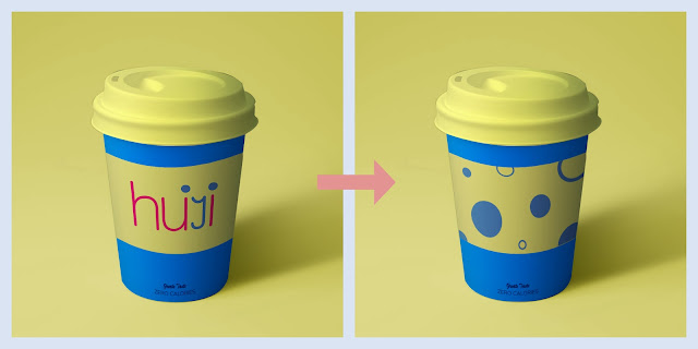
In the week 7 feedback,
Mr. Vinod mentioned that
my wordmark was a bit
overwhelming. As a result,
I replaced the packaging
of the coffee cup
collateral with various
shapes composed of
circles. These circles
were derived from the dots
above the letter 'i' in
the wordmark.

Fig. 4.2 Redesign the coffee
cup, week 7
(11/10/2023)
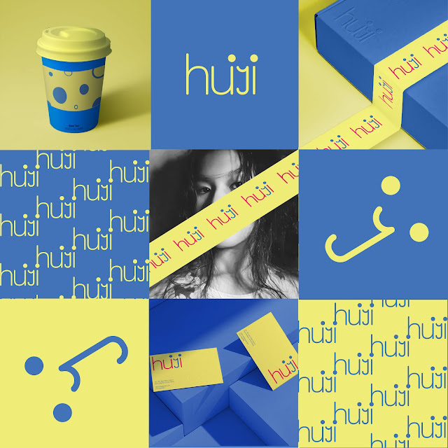
Fig. 4.3 is the final
Instagram layout, and
I hope that these
colours can bring joy
to people!

Fig. 4.3
Final IG
layout, week 7
(11/10/2023)
Next, I need to
animate my wordmark,
and I've chosen After
Effects as my
preferred software
because I'm more
familiar with it, and
it offers more
functionality compared
to Photoshop. I want
to create an animation
that starts with the
happy expression from
the wordmark, as shown
in Fig. 4.4.
.png)
Fig. 4.4
Animating in
After Effects,
week 8
(18/10/2023)
I want the eyes
to drop from
above (don't be
alarmed, it
turned out quite
well), and I
added motion
blur to make the
animation
smoother, as
shown in Fig.
4.5.
.png)
Fig. 4.5 Adding
motion blur,
week 8
(18/10/2023)
I created a
blinking effect
using an oval mask
by adding
keyframes for both
the initial and
final positions
and adjusting the
mask's size.

Fig. 4.6
Adding an
elliptical
mask to create
a blinking
effect, week 8
(18/10/2023)
I want to create
an animation
where the
mouth's lines
gradually 'draw'
by adjusting the
mask's size.
.png)
Fig. 4.7
Adding an
elliptical
mask to
create a
blinking
effect, week
8
(19/10/2023)
.png)
Fig. 4.8
Screenshot
process, week
8
(19/10/2023)

Fig. 4.9
Final GIF,
week 8
(19/10/2023)
Final
Outcome:

Fig. 5.0 Final
key artwork -
B&W, week
8 (19/10/2023)

Fig. 5.1 Final
key artwork -
coloured
1, week 8
(19/10/2023)

Fig. 5.2 Final key
artwork - coloured
2, week 8
(19/10/2023)

Fig. 5.3 Final key
artwork - coloured
3, week 8
(19/10/2023)

Fig. 5.4 Final
animation -
GIF, week 8
(19/10/2023)
Fig. 5.5
Colour palette, week 8
(19/10/2023)

Fig. 5.6
Final collateral
1, week 8
(19/10/2023)

Fig. 5.7
Final collateral
2, week 8
(19/10/2023)

Fig. 5.8
Final
collateral
2, week 8
(19/10/2023)
Instagram
link: https://www.instagram.com/hui_._.yi/

Fig. 5.9
Final
Instagram
Page, week 8
(19/10/2023)
Fig. 6.0
Final Task 2
-
PDF, week 8
(19/10/2023)
FEEDBACK
Week 4
General Feedback: A wordmark should ideally have
meaning and be memorable.
Specific Feedback: For my poster, there's no
problem. Regarding the key artwork, Mr. Vinod suggested that I
concentrate on a single characteristic and think about what I
want to convey. The meaning is essential. In my last two
designs, which appear to reflect an interest in constructing
things, I can investigate different thicknesses and styles to
enhance my design.
Week 5
Specific Feedback: Good, but Mr. Vinod suggested
that I reduce the spacing between the letters; it's a bit loose.
Week 6:
General Feedback: The logo must be clear and
legible. Copying the wordmark and pasting it onto collateral
materials is not acceptable. It needs to incorporate strong
colors to make the brand stand out, but the full wordmark should
not be discarded.
Specific Feedback: Pastel colors are the least
desirable for the brand.
Week 7:
General Feedback: We can enlarge certain parts of our
collateral.
Specific Feedback: I can retain the overall colour scheme of
IG, but there are too many instances of my wordmark. For the solution,
Mr. Vinod suggested that I replace some product logos with elements
from the wordmark, such as dots and lines.
REFLECTIONS
Experience:
This is my first time having my own wordmark, and I'm quite satisfied
with it. Task 2 allowed me to understand what collateral is, even though
I encountered many difficulties during the process, I still completed
it, and I am very happy.
Observation:
I found that when I don't have a clear goal for doing something, I tend
to feel lost and create a lot of unnecessary things, while also wasting
my time.
Findings:
This task made me realize that creating a good wordmark is not as
simple as it may seem, even though it may appear as simple lines or
shapes to the average person. At the same time, I also understand that
producing effective collateral is indeed not easy.
FURTHER READING
The Gestalt Principles

Fig. 6.1 Image taken from
article
The Gestalt Principles are fundamental laws of human perception that
guide how individuals naturally group, interpret, and simplify
visual information. Designers use these principles to create
aesthetically pleasing and easy-to-understand interfaces. Key
principles include emergence, closure, common region, continuity,
proximity, and more, helping design elements to be recognized and
organized effectively.
The Wordmark Logo
Fig. 6.2 Logo symbol vs.
wordmark difference (image
taken from article)
A logo is a vital visual element that represents an organization,
company, or product. Traditionally, logos consist of a logo symbol (a
pictorial icon) and a wordmark (the brand name in a specific font).
Wordmark logos, focusing on the text, are preferred in design,
fashion, beauty, and tech industries for their modern, minimalistic
style. Designing a wordmark involves creating a visually distinctive
letter or combination, ensuring readability across applications, and
selecting fonts and colors to convey the brand's identity effectively.
The choice between a wordmark-only logo and one with a logo symbol
depends on the brand's goals and target audience. Both options have
their merits.


Comments
Post a Comment