Interactive Design - Exercises
27.8.2023 - ? (Week 1 - Week )
Chong Hui Yi / 0363195
Interactive Design / BDCM
Exercises
INSTRUCTIONS
<iframe src="https://drive.google.com/file/d/19K7sai7Rdfy3_GxqSVJlxpkQ_RCjyOUe/preview" width="640" height="480" allow="autoplay"></iframe>
Website 1 (https://youcanbeanything.tftl.agency/)
Purpose & Goals
The website provides information about Barbie, allowing readers to
gain a clear understanding of Barbie's historical development process.

Fig. 1.0 Screenshot from website 1
Visual Design & Layout
The website's theme colors, predominantly pink and blue, align
perfectly with the content related to Barbie. However, there are some
issues with font colors and backgrounds being too similar, which can
hinder readability. It is recommended to adjust these color
combinations for improved legibility. In the section dedicated to
Barbie's history, the text on posters is sometimes too small, so it is
recommended to enlarge the font size for easier reading. The website
makes extensive use of images, which effectively captures the user's
attention.
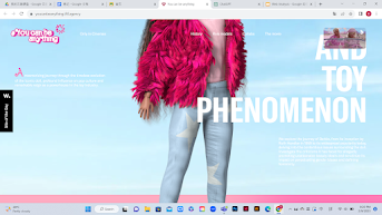
Fig. 1.1 Legibility issue due to font color & background
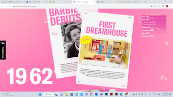
Fig. 1.2 Small text size makes it difficult to read
Functionality & Usability
The website features a clear navigation bar, allowing users to quickly
find the content they are looking for, and it also incorporates
interactive designs to engage the readers in an enjoyable manner. For
example, in Fig. 1.3, this section of the website allows text and
images to enlarge and rotate in a spiral manner when scrolling down.

Fig. 1.3 Interactive element

Fig. 1.4 Navigation bar

Fig. 1.5 Timeline Navigation Buttons
Content Quality & Relevance
The website offers accurate, comprehensive, and well-organized
information, encompassing the significant historical records of
Barbie. Additionally, it showcases various Barbie doll images and
their respective names, enabling users to gain a deeper
understanding of Barbie. This content is highly relevant to the
website's objectives and theme.
.png)
Fig. 1.6 Barbie doll images & names
.png)
Fig. 1.7 The evolution of Barbie
Performance
Due to the large number of images on the website, it takes some
time to load. It displays correctly on different devices and
browsers, but on certain devices, the 3D Barbie at the beginning
of the website is only partially visible, with her feet obscuring
the content.
.png)
Fig. 1.8 Barbie partially obscured
.png)
Fig. 1.9 Barbie's Feet Covering Content
Website 2 (https://fasterdisplays.com/en/exhibitor)


.png)
.png)
Purpose & Goals
.png)
.png)

Functionality & Usability
The website's goal is to promote Fast Displays brand's
products by clearly highlighting the main advantages
of the products and providing product information
while guiding users to take action.
.png)
Fig. 2.0 Screenshot from website 2
Visual Design & Layout
The website adopts a clean and comfortable overall
design with a minimalist black-and-white color
scheme and the use of sans-serif fonts. The use of
animation to explain product features adds an
engaging element to the site, making it visually
appealing.
.png)
Fig. 2.1 Clean Layout
Fig. 2.2 Product structure animation
Clear and descriptive labels facilitate easy navigation
throughout the website. However, clicking on 'Order your
display' only leads to a contact information form rather
than directly redirecting users to the purchasing
website, which may be seen as inconvenient.
Additionally, the use of scroll-triggered animations
adds an engaging and participatory element to the user
experience, making the website more dynamic and
interactive.

Fig. 2.5 Navigation bar
.png)
.png)
.png)
Fig. 2.6 Contact form
.png)
Fig. 2.7 Interactive element
Content Quality & Relevance
The website employs concise text alongside product
images and animations to efficiently convey
information. The content and layout are
well-organized, and products are categorized for
clarity and ease of navigation. However, the website
does not display product prices or provide links for
users to navigate to the purchasing website.

Fig. 2.8 Image with text explanation
.png)
Fig. 2.9 Product information without
prices
Performance
.png)
The website loads quickly and displays correctly on
different devices and browsers.
.png)
Fig. 3.0 Website Viewable on Different Devices
.png)
Fig. 3.1 Website Viewable on Different
Devices
Exercise 2 - Web Replication:
" Your task is to replicate TWO (2) existing main pages of the websites. This exercise will help you develop your design skills using software such as Photoshop or Adobe Illustrator, and gain insights into web design best practices. The image that you will be using does not have to be an exact image from the original website. You may replace it with a similar image. Focus on the layout, type style, and color style."
" Your task is to replicate TWO (2) existing main pages of the websites. This exercise will help you develop your design skills using software such as Photoshop or Adobe Illustrator, and gain insights into web design best practices. The image that you will be using does not have to be an exact image from the original website. You may replace it with a similar image. Focus on the layout, type style, and color style."
Website 1 (OCEAN HEALTH INDEX)
First, I capture the entire website by taking a screenshot. Inspect
> Ctrl + Shift + P > type "SCREEN..." > select "Capture full size
screenshot

Fig. 2.1.0 Screenshot from website 1, week 2 (8/9/2023)
I couldn't find the background for the first image in Fig. 1.1, so I
decided to create it directly using the Pen Tool and Ellipse Tool.
Afterward, I used the eyedropper tool to extract the colors.

Fig. 2.1.1 Create background with Pen & Ellipse Tools, week 2 (8/9/2023)
At the beginning, I used a variety of fonts on a website, and it felt
quite chaotic. When I finished the replication, I suddenly found the
original website's font 'Montserrat' on Fontshare. I was really thrilled,
but it also meant that I had to replace all the fonts, which took some
time.

Fig. 2.1.2 Montserrat Font's special characters, week 2 (8/9/2023)
I identified the original website's font because I noticed the unique
design of the letters 'G' and 'S,' as shown in Fig 1.2. So, I searched
for a font that matched these characters.
.jpg)
Fig. 2.1.3 original (left) vs replication (right), first attempt, week 2 (8/9/2023)
Fig. 1.1 displays a portion of my website replication. At this point, the
font I chose, while similar to the original website, still had some
differences.

Fig. 2.1.4 original (left) vs replication (right), second attempt,
week 2 (8/9/2023)
In the second attempt, after changing the fonts, it looks very similar
except for the background image, which I found on the Pexels website.
.png)
Fig. 2.1.5 Screenshot process, week 2 (8/9/2023)
I have divided the website into three separate parts.
.png)
Fig. 1.6 Outline view of web replication 1 (#1), week 2
(8/9/2023)
.png)
Fig. 1.7 Outline view of web replication 1 (#2), week 2
(8/9/2023)
.png)
Fig. 2.1.8 Outline view of web replication 1 (#3), week 2
(8/9/2023)
Final Result - original (left) vs replication (right):
.png)
Fig. 2.1.9 Web replication 1 (#1), week 2 (8/9/2023)
.png)
Fig. 2.2.0 Web replication 1 (#2), week 2 (8/9/2023)
.png)
Fig. 2.2.1 Web replication 1 (#3), week 2 (8/9/2023)
Compared to the other two websites, this one is longer and includes
numerous images, all of which can be found on the original website. I
selected the 'Satoshi' font because it offers a variety of type families
and bears resemblance to the font used on the original website.
.png)
Fig. 2.2,2 Screenshot from website 2, week 2 (9/9/2023)
First, I created guides to outline the positions and sizes of all
the images. Then, I placed the images, logos, and lines
accordingly.

Fig. 2.2.3 Using guides for image positioning, week 2 (9/9/2023)
I used a rectangle and the Pen Tool to draw the purple open
quotation mark.
.png)
Fig. 2.2.4 Open quotation mark made from rectangles & lines, week 2 (9/9/2023)
Fig. 2.2.5 The logo creation process, week 2 (9/9/2023)
Finally, I added all the text, adjusted the text size and leading,
and that completed the exercise1.
.png)
Fig. 2.2.6 Outline view of web replication 2 (#1), week 2
(9/9/2023)
.png)
Fig. 2.2.7 Outline view of web replication 2 (#2), week 2
(9/9/2023)
.png)
Fig. 2.2.8 Outline view of web replication 2 (#3), week 2
(9/9/2023)
Final Result - original (left) vs replication (right):
.png)
Fig. 2.2.9 Web replication 2 (#1), week 2 (9/9/2023)
.png)
Fig. 2.3.0 Web replication 2 (#2), week 2 (9/9/2023)
.png)
Fig. 2.3.1 Web replication 2 (#3), week 2 (9/9/2023)
.png)
Fig. 2.3.2 Web replication 2 (#4), week 2
(9/9/2023)
.png)
Fig. 2.3.3 Web replication 2 (#5), week 2
(9/9/2023)
.png)
Fig. 2.3.4 Web replication 2 (#6), week 2
(9/9/2023)
Exercise 3 - Creating a Recipe
Card
"In this exercise, you will create a recipe card using
HTML and CSS. The goal is to design a basic webpage that
displays a recipe's ingredients and instructions in a
visually appealing format."
We can find a recipe on the following two websites,
and I finally chose
Pandan Coconut Ice Cream (it looks delicious).
I first put the necessary text and images into the
HTML. Then, as shown in Fig. 3.1.0, I divided my
recipe card into five sections: the title, a brief
description, 'Ingredients,' 'Instructions,' and
'Notes.'

Fig. 3.1.0 HTML, week 6 (9/10/2023)

Fig. 3.1.1 Recipe card, week 6 (9/10/2023)
I used the right-hand image from Fig. 3.1.2 as the
background for the recipe card, matching the green
colour associated with pandan.

Fig. 3.1.2 Reference images, week 6 (9/10/2023)
I'm not sure if I need to include navigation, but I
added it for now. If it's not needed, I can always
remove it later. I learned online how to align the
list in HTML with the title on the same line, which
makes it look more like navigation.

Fig. 3.1.3 Navigation, week 6 (9/10/2023)
I felt that the leading between the lists seemed a
bit small and not conducive to readability, so I
tried adding a margin-bottom of 8px to them.
.jpg)
Fig. 3.1.4 Add an 8px margin-bottom to the 'li' tags with the 'list' class, week 6 (9/10/2023)
If I want to make any desserts or cakes, I prefer
those that don't require professional machinery, so I
emphasized 'without an ice-cream machine!' in bold and
changed its color using CSS.
.jpg)
Fig. 3.1.5 Bold the emphasis, week 6 (9/10/2023)
I tried centering the image, but the result
didn't look as ideal, so I reverted to having the
image on the left side.

Fig. 3.1.6 Attempt to center the image, week 6 (9/10/2023)
.png)
Fig. 3.1.7 Final HTML, week 6
(10/10/2023)

Fig. 3.1.8 Final CSS, week 6
(10/10/2023)
I changed the default font to the sans-serif
Quicksand, which looks neater. In addition, I
think a recipe card should not require navigation
or a comment submit button, so I have removed
both. Fig. 3.1.7 is a before-and-after comparison
image with added CSS.
.jpg)
Fig. 3.1.9 Before vs After, week 6
(9/10/2023)
Final Outcome:
Recipe Card Link: https://exercise3-chonghuiyi.netlify.app/

Fig. 3.2.0 Final Recipe Card, week 6 (9/10/2023)
REFLECTION
Web Replication:
In this exercise, the biggest challenge I
encountered was finding similar images and fonts.
I spent a lot of time on this, especially when
adjusting font sizes and leading. The guides and
grids were really helpful, as they eliminated the
need for me to measure by eye. I don't think this
exercise was particularly difficult, but it did
require patience and time.
Recipe Card:
I feel that exercise 2 can help reinforce the
knowledge I've learned in class. Throughout the
process, I kept referring back to the HTML and CSS
exercises we did in class, and it felt more
challenging to do it on my own, unlike in class
where we just follow Mr. Shamsul. Dreamweaver is
very convenient, because it suggests possible
options with just a keyword. Although the results
are relatively simple, I find a sense of
achievement in it, and I also appreciate that
coding is something magical.


Comments
Post a Comment